Tom’s mention of Bones and Anacostia reminded me of an odd thing I noticed in AT&T’s “Rollercoaster” spot over the weekend.
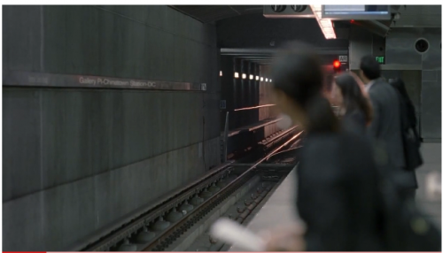
In the very first vignette in the ad, a rollercoaster pulls into a subway station and all the suits board it. The sign on the wall of the subway station reads “Gallery Place-Chinatown Station-DC.” But the station they’re all standing in is manifestly NOT a Metro station.
At first I thought that it was just a badly-localized version of the ad, in which AT&T attempts to pander to potential customers in large cities by slapping the name of one of their transit stations on the wall of the rollercoaster subway without making any other attempt to make the set look like said station, and then getting the signage wrong on top of that. But no, this is the national version of the ad.
And that’s what makes it so confusing- if they were going for an “it’s appropriate for government business too!” message, why not pick a more famous DC station name? Smithsonian. Dupont Circle. Hell, even L’Enfant Plaza. And why stick that information on a sign that you barely see instead of making your fake Metro station actually, you know, LOOK like a Metro station? Or even showing a guy entering a station with a monument or something in the background?
It’s indisputably wrong, but I can’t figure out why they bothered sticking a faux DC Metro sign on their ad. It’s distracting.

(click to embiggen)


Here’s a reason for pretending it’s DC: Metro is currently the largest subway system (and indeed, I’m not sure which, if any others, yet have it) with AT&T service inside the underground stations. It would be odd to have someone checking their phone in an NYC subway station–where cell reception has long been in the works but has not yet arrived.
The actual subway in the ad is LA’s subway. LA’s subway gets used for a lot of ads and TV shows as a stand-in for other cities, since they film lots of stuff in LA.
Nitin, that’s interesting, thanks. But I guess in that case my question is why was the attempt to make it look like DC so half-assed? Anyone who knows enough about subway systems to know that DC’s AT&T coverage is unique has got to know the Metro doesn’t look anything like that. The sign on the wall seemed like an afterthought.
Well, the dc headquarters are located above the gallery place/Chinatown stop – above the Chinatown exit specifically. I could imagine a scenario where someone corporate worked on an ad that ended up being filmed by a different group or agency.
Tiffany: I agree that anyone familiar with DC would agree that it looks nothing like Metro, and that’s a shame. I guess it was probably cost-prohibitive to do it in DC but they didn’t want to keep the LA signage since there’s no AT&T access in LA’s underground stations.
It is also notoriously difficult to film in Metro for commercial purposes. I actually can’t think of a single movie/advert/tv show that “gets Metro right.” More often than not Metro is magically morphed into a NYC rail car and platform.
@Eric Yes, I am well aware of that, and when the movie is set in DC, it makes sense, even if it’s grating. But the commercial wasn’t set in any one particular city, so I’m still not sure why BBDO would bother using a DC sign when they could have just not shown any particular station name.