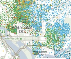
It’s hard not to get lost in a data projection like the NYT’s Mapping America: Every City, Every Block, which allows you to parse through 20 or so different projections of the American Community Survey data over the last five years from the Census Bureau. When you can see the geographic correlations of education levels and income (check out the dividing line at 16th street in both cases), it’s a stark reminder of the different Washingtons that exist.
Be sure also to check out DCist’s initial take (focused on demography and increase/decrease) and GGW’s initial take (focused on population shift between wards)
This is a data goldmine, and the sort of thing that yours truly is absolutely in love with. Parse through this with us over the next couple weeks.


Strange. Map shows tons of people living deep inside rock creek. Not possible. Something’s off.