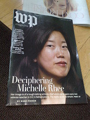
‘New look for the Wash Post magazine’
courtesy of ‘ShashiBellamkonda’
If you picked up the Sunday Post today, you might nearly have thrown out the newest thing in it, the redesigned Post Magazine. We’ve talked a bit about the Magazine recently, and a redesign of the Post’s long-form contribution each week is certainly welcome.
What I found inside largely turned me off. It wasn’t the articles, though; Marc Fisher’s return to the Post is an excellent profile of Chancellor Michelle Rhee and sets the bar for content, but it’s the ads and the layout that are distracting. Flipping through, I found a lot of what felt like recycled content from the Going Out Gurus, and little bits that probably could’ve played well in Style, but the whole thing felt…odd.
Perhaps I’m too young to want the magazine format, though Wired continues to get my annual subscription for its layout and content. Perhaps I’m too used to the Post’s continual stream of excellent web content. Perhaps I’m just not a magazine sort of fellow, but all of this combines into something I read from cover to cover and didn’t feel I got anything from. Perhaps that was the barrage of full-page ads to ignore. I felt that if I were to filet out the good content from ads, I’d have been left with about four pages of excellent writing, and it deserves better than to be dressed up so badly with ads.


Did anyone notice the two page Eileen Fisher spread ad right after Rhee’s front cover?
Do you think that was strategic ad placement or just shear dumb luck?
Is there such a thing as dumb luck when it comes to product placement? Not often, from what I’ve witnessed.