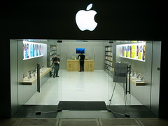
photo courtesy of ping ping
Apple, known for its sleek, modern designs, has failed to impress the city of Georgetown with its architectural plans for their store. Apple’s architectural firm, Bohlin Cywinski Jackson, had plans for “an all-glass front at street level, topped by a slab of masonry with an Apple logo cut through it”.
“The design was too much like a billboard,” said Thomas Luebke, secretary of the commission appointed by the U.S. Commission of Fine Arts. It seems to me that other stores in Georgetown have a pretty modern design (e.g. Puma and Adidas), but the all-glass storefront seems to be the sticking point. Continue reading
