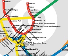
Map by MV Jantzen
We all have our own internal mental map of the Metro that takes into account weekend track work, single tracking, transfers between lines, transfers to buses, and I suspect they look an awful lot like MV Jantzen’s Distorted Metro Map. The cleverly-done HTML 5 app moves the iconic map around a polar scale, putting time distance between station at a premium instead of a clear map, moving stations into closer proximity if they’re closer by time than necessarily by distance.
There’s also a bad-ass Pac-man mode where you get to gobble up the stations like power pellets, which, frankly, is all I’ve ever wanted to do to the Red Line.


