Photo Courtesy of the Washington Nationals
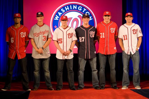
Clean-cut and no frills – that’s what the Washington Nationals new set of uniforms for the 2011 season are. The fan-favorite curly W that is predominately displayed as an integral logo of the Nationals organization is now the cornerstone of the front office’s attempt to provide their players and fans with a sense of baseball identity.
According to Nationals Chief Operating Officier Andrew Feffer, the organization spent the entire season getting the feel for what District baseball fans would like to see if any changes to the uniforms were made. A combination of focus groups, surveys and casual conversations brought the Nats uniforms to where they are and will be for the duration of 2011 – a red, white, and blue palate of patriotism garnished with a curly W.
Some fans and critics of the team have already expressed their disdain for a lack of the team’s name being prominently displayed on the front of the home jersey but that’s the thing about uniform changes … not everyone’s always going to fall in love at first sight.


Photos Courtesy of the Washington Nationals
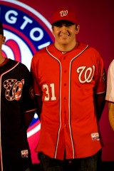
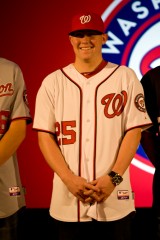
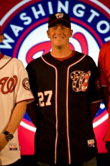
The Nats’ new threads were met with a high approval rating from the players attending as models for Wednesday evenings unique invite-only fashion show at Nationals Park. The general consensus was a definite thumbs-up for the new white home jerseys.
When asked whether or not he found it strange that not a single uniform in the set features the team’s name on the chest, Tyler Clippard wasn’t too worried. “It’s fine with me,” he said. “They look really good to me. They’re kind of clean and … you know … everyone knows we’re the Nationals.”
Jordan Zimmermann described the new uniform changes as “subtle but good” which is exactly the point to be made. Ian Koski of Nationals News Network ran a great piece about how a simple logo is etched in the mind as a mental picture far quicker than an overdone frenzy of graphics and color.
In an interview with Armin Vit – who analyzes logos and visual identities at BrandNew.com – Koski gets the graphic design perspective of the Nats’ big change.
“It used to be simplicity: The Lakers, the Bulls, the Yankees, the Cubs…,” Vit said. “All those logos were simple and looked great on t-shirts and baseball caps and on mugs. Today’s logos look like wild amusement rides. A good test for a good sports logo — or any logo for that matter — is, can you draw it from memory? If you can’t, it’s needlessly complicated but more important, it doesn’t create a connection,”
As far as the biggest changes, here’s a breakdown:
- The most significant changes are on the front of the home, road and alternate uniforms. The team name, Nationals, is now replaced by the Curly W.
- Uniform number will be displayed on the right side of the jersey.
- There is a new primary logo of Washington Nationals’ organization on the left sleeve replacing the former block letter logo.
- The MLB silhouette batter colors have changed to red white and blue.
- The back of the jersey has the players’ names and numbers with red with blue outline.
- All gold trim was removed.
- The special occasion jerseys for Memorial Day, the Fourth of July, September 11, and military appreciation days remain blue and patriotic but the stars and stripes do appear inside the curly W.
- The road uniform remains gray, but the hat will change to darker blue with a red bill.
- The road/alternate hats are a darker blue with a red bill for the road.
Fans in attendance for the unique fashion show and cocktail reception hosted by the team were treated to a true surprise.
According to die-hard Nats fan Laura Murphy, the event’s set up and execution was incredible. “I expected a small stage and not a legitimate catwalk,” she said. “I was very impressed with the catwalk and very impressed with the boys.”
It’s true. They did do their little turns on the catwalk, strutting their off-season selves with two Nat Pack lady models – one for each arm.
How did the Nats fare as models? Murphy said they were pretty good but Zimmerman definitely had the best twirl.
Jerseys are now available for purchase on at the Nationals Park Team Store. Doors open at 8:00 a.m. and players will be signing autographs and greeting fans from 11:30 a.m. to 2:00 p.m. Fans can receive 15% off a new jersey if they turn in any MLB jersey through December 1st.
—
More pictures are available, compliments of Nationals Daily News‘ Ian Koski.


I do like the new logo — that block “Nationals” thing wasn’t my favorite. Wonder if they’re changing the scoreboard to reflect that.
Pingback: Tweets that mention The Nationals Get New Uniforms » We Love DC -- Topsy.com
Two posts about the new team jerseys? I know they’re paying you to write stuff, but that’s too much. And this entire post is just a press release! I think my favorite quote is the obsequious fawning from the “die-hard Nats fan” (as if such a thing exists) about how the “event’s set up and execution was incredible.”
Seriously, you people should be ashamed. What a joke.
Joe, I think you may be under a misapprehension about the nature of We Love DC. Our writers are essentially volunteers. We accept advertising, but after expenses and after being split across all the people that make WLDC what it is, the payout to each individual writer is squarely in the realm of what you’d call “beer money.” If it’s been an especially good month, a writer might make “beer and pizza money.”
What we ARE able to offer our writers reliably is a venue for them to share their passions with others who share them. As it happens, there are indeed die-hard Nats fans, and Rachel is one of them.
So no, our writers are not “paid to write this stuff,” nor are they paid to tolerate abuse from readers. Your opinion that the Nats uniforms were over-covered is noted, but we require that any further comments on the topic not contain personal attacks on the writers, or any other member of the WLDC community for that matter.
You have a long history of productive comments here, but that doesn’t give you license to come into our house to insult us.
The best part to the new unis?
Much harder to have typos on the front of the jersey ;)
Hey Andy Feffer: Tell your boys to worry less about the “W”s on the jerseys, and more about the “W”s on the left hand side of the win/loss column.
Also, please don’t insult our intelligence by saying that you wanted to “get a feel for what District fans wanted…”. It’s hardly a surprise that the home uniform was changed, when everyone knows that the Nats sold more jerseys this year (because of a certain #37) than in the history of the franchise in DC. And now, all of those fans are going to think they have to go an get another #37 off the rack, to be up to date.
Also, why change the all-navy blue away caps? From a casual observers standpoint, the away caps were becoming quite popular not just in DC-proper, but across the country and in pop-culture.
The whole operation is like watching a chef who keeps putting more and more tiny ingredients into the soup. Leave it alone and let it simmer.
(also, commenter #3 joe? – you gotta cool out man. seriously.) :)